Transforming the ambiance of your home to mimic the luxurious feel of a high-end hotel is all about choosing the right paint colors. Designers across the globe have shared their go-to shades that evoke the sophistication and tranquility of world-renowned hotels. These colors not only enhance the aesthetic appeal but also create a warm, inviting atmosphere.
From deep greens to serene blues, these shades will make your home feel like a refined retreat. Here are 8 paint colors that can bring that hotel luxury vibe into your living space.
8. Benjamin Moore’s Mexican Tile

For those hesitant about bold colors, Benjamin Moore’s Mexican Tile offers a vibrant yet welcoming option.
Used in Cleveland’s Fidelity Hotel, this hue complements floral patterns and furnishings, creating a lively yet relaxed atmosphere that greets guests with warmth and style.
7. Farrow & Ball’s Green Smoke
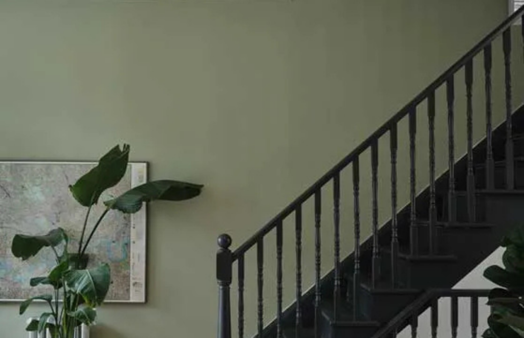
Farrow & Ball’s Green Smoke brings a sense of depth and mood to any space, as demonstrated in Hotel Glorieta.
This deep green shade updates the hotel’s classic pine furniture, offering a contemporary flair that feels curated and sophisticated.
6. Paint & Paper Library’s Deep Water Green
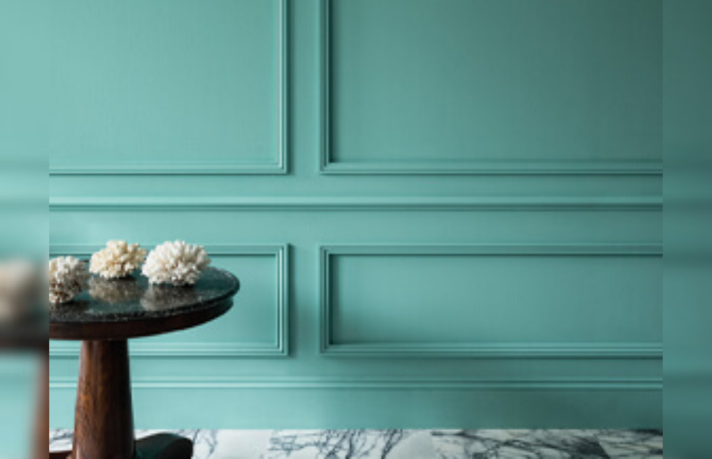
Deep Water Green from Paint & Paper Library channels the glamour of London’s theatreland.
Used in Beaverbrook Town House, this bold teal creates a playful yet luxurious setting that feels both theatrical and intimate, perfect for a home that wants to make a statement.
5. Sherwin-Williams’ Iron Ore
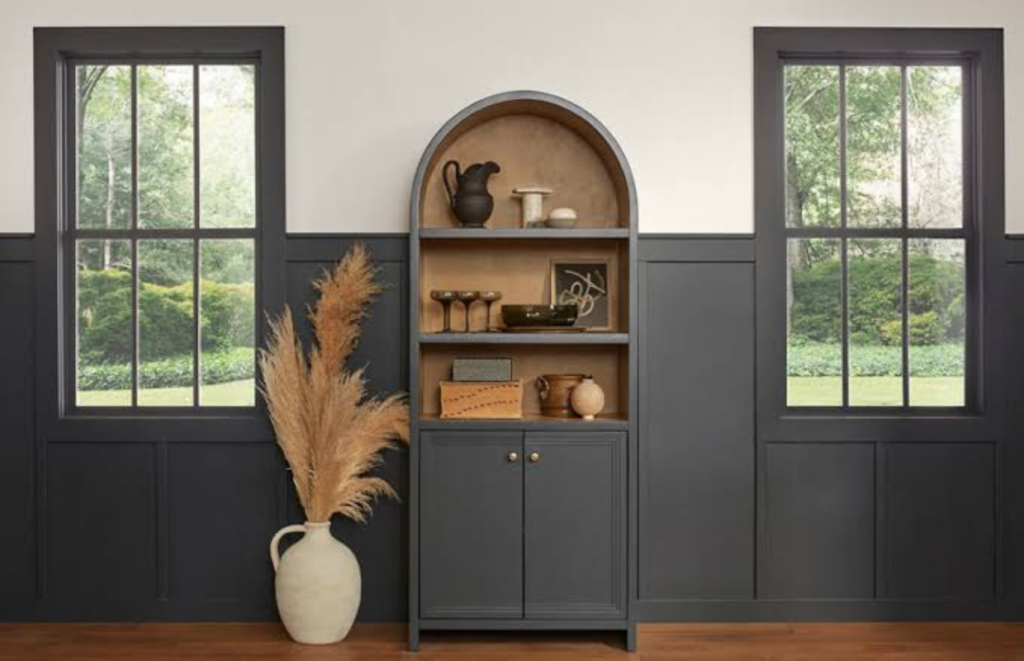
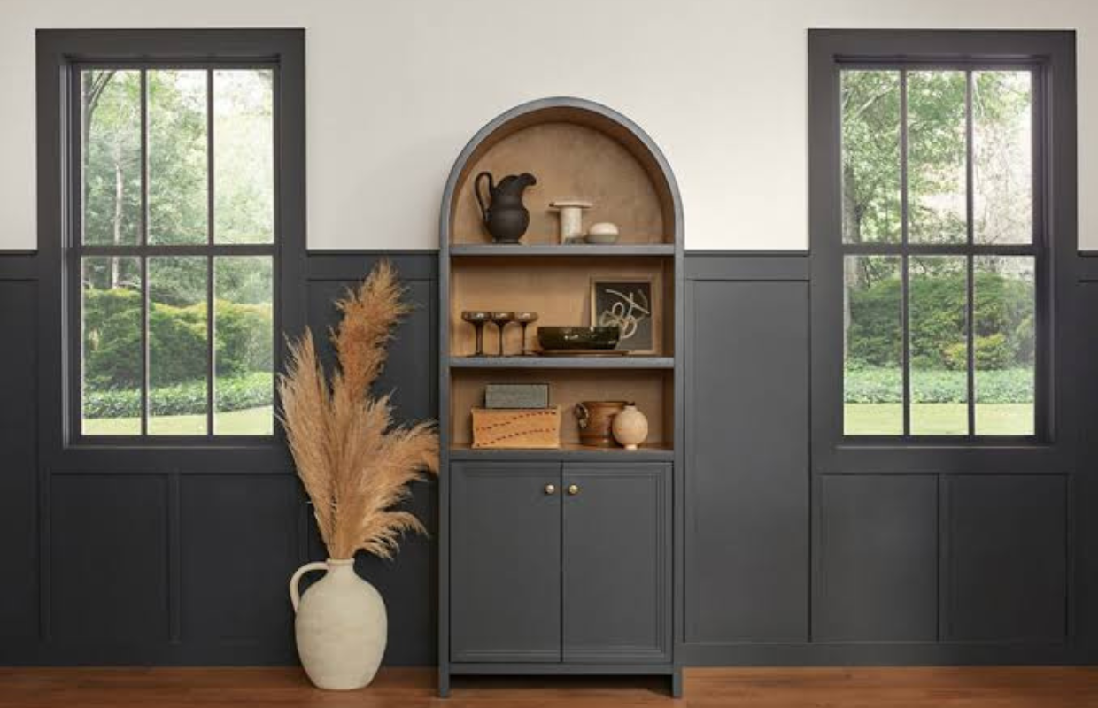
Iron Ore by Sherwin-Williams is a dark gray that adds a moody elegance to any room.
Featured in Drift Santa Barbara, this color is paired with light wood and linen to create a dreamy atmosphere that’s inviting rather than oppressive.
4. Benjamin Moore’s Coral Dust
Benjamin Moore’s Coral Dust offers a potent yet tranquil vibe, perfect for creating a coordinated interior.
Seen in Baltimore’s Ulysses Hotel, this shade is used not only on walls but also in furnishings, offering a cohesive look that’s rich and inviting.
3. Benjamin Moore’s Blue Note
Blue Note from Benjamin Moore connects spaces to their natural surroundings with its serene blue tones.
Used in Populus Seattle, this hue pays homage to the Northern Cascades and Puget Sound, offering a stylish yet natural touch to any bedroom.
2. Sherwin-Williams’ Shade-Grown
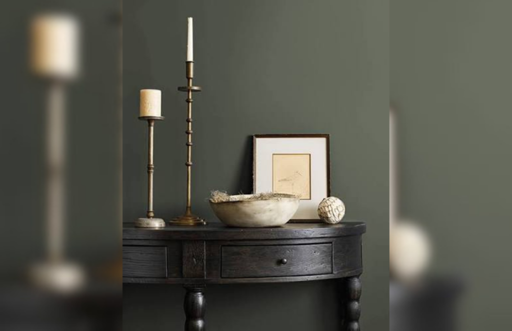
Sherwin-Williams’ Shade-Grown is a moody dark green that brings warmth and intimacy to any room.
At the Atticus Hotel in Oregon, this color is part of a Pacific Northwest palette that embraces the region’s moody tones, making spaces feel cozy and inviting.
1. Benjamin Moore’s Bewitched
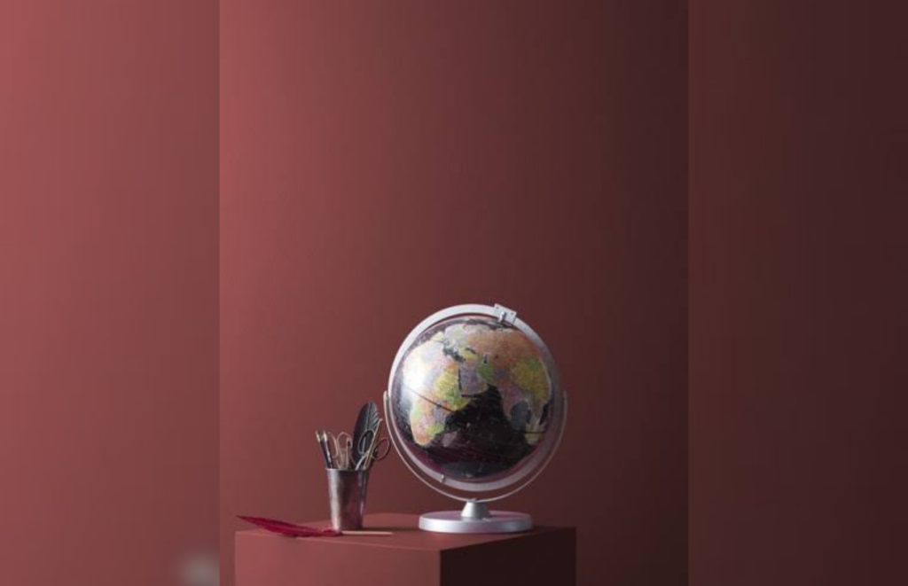
Benjamin Moore’s Bewitched is another enchanting color choice that offers tranquility and style.
Used throughout Baltimore’s Ulysses Hotel, this shade enhances the space with a coordinated look that’s both potent and serene, perfect for creating a luxurious home environment.
Read More:
- 10 Creative Ways to Break Traditional Decorating “Rules”
- 9 Reasons Designers Are Falling for the Cashmere Kitchen Trend
- 9 Retro Home Trends Making a Stylish Comeback